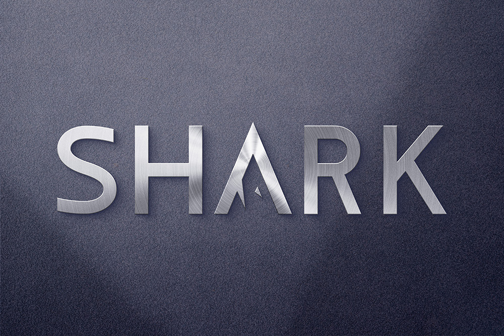
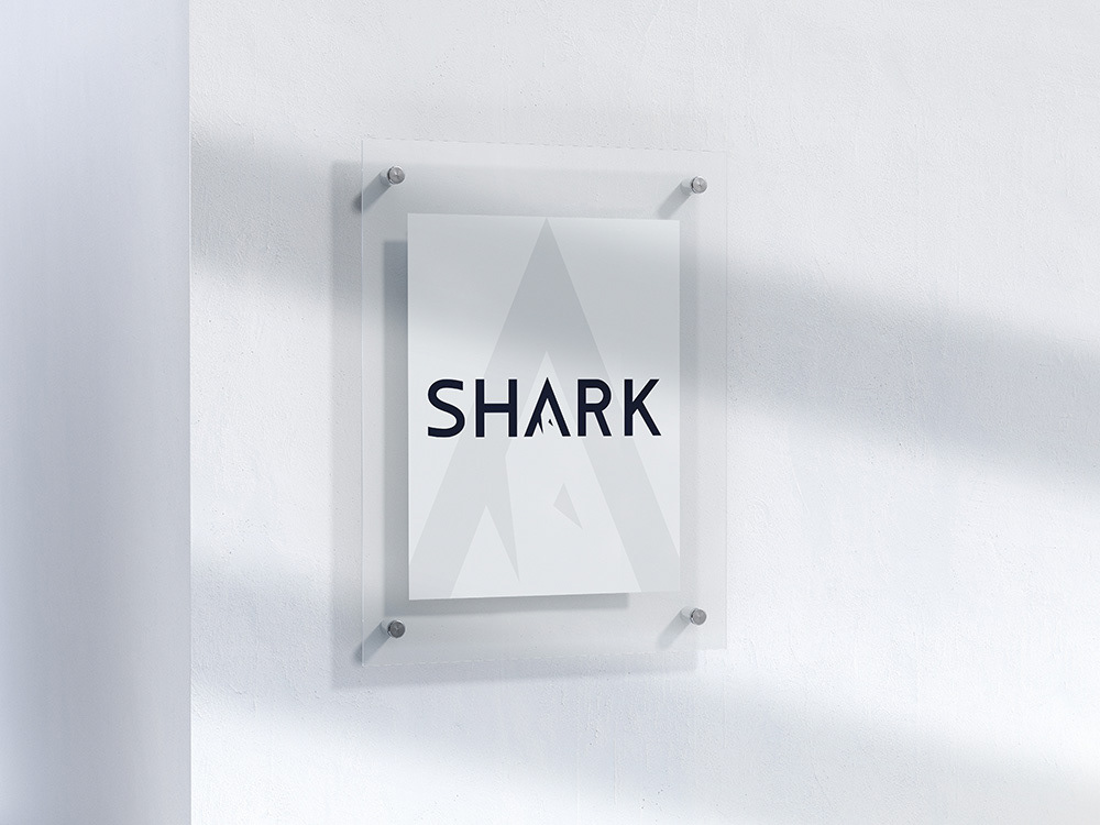
Logo design for the company SHARK, which develops web and mobile applications.
The task was to develop a strict laconic logo that would reflect the name of the company.
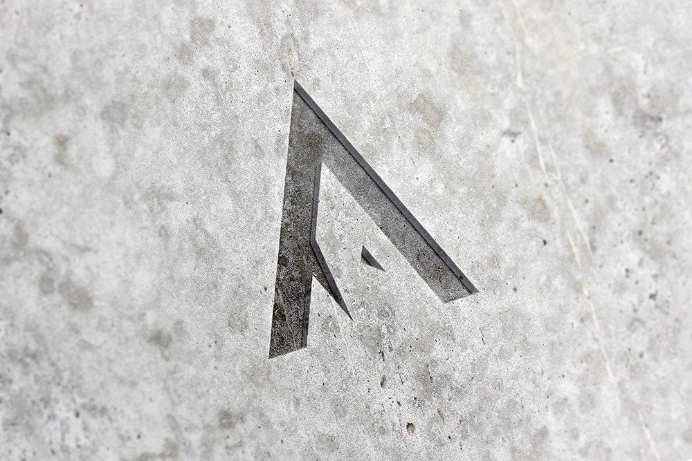
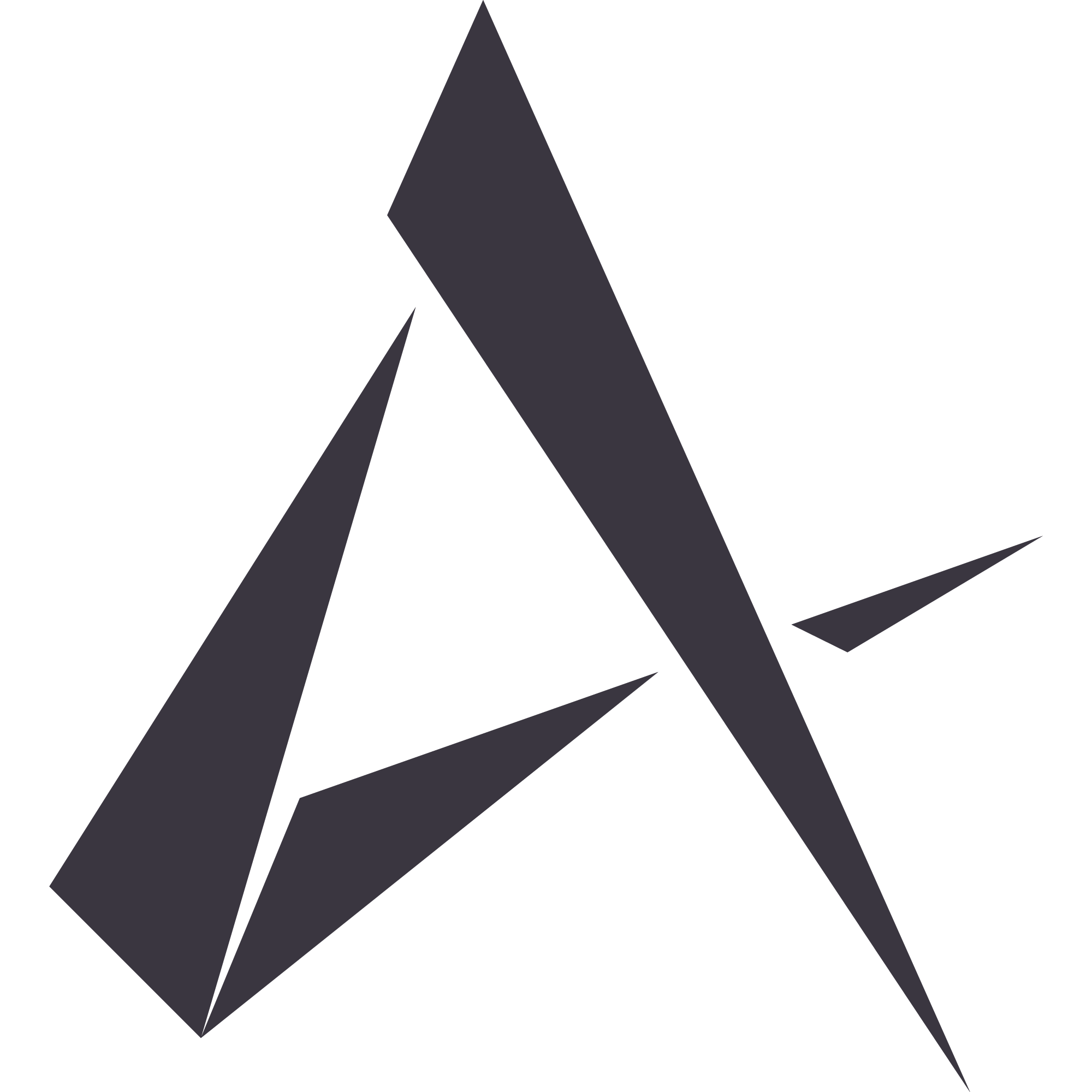
The letter A was taken as the basis, as the first letter of the name of the founder of the company. It symbolizes the shark, where the horizontal line of the letter represents the eye and teeth of the shark.
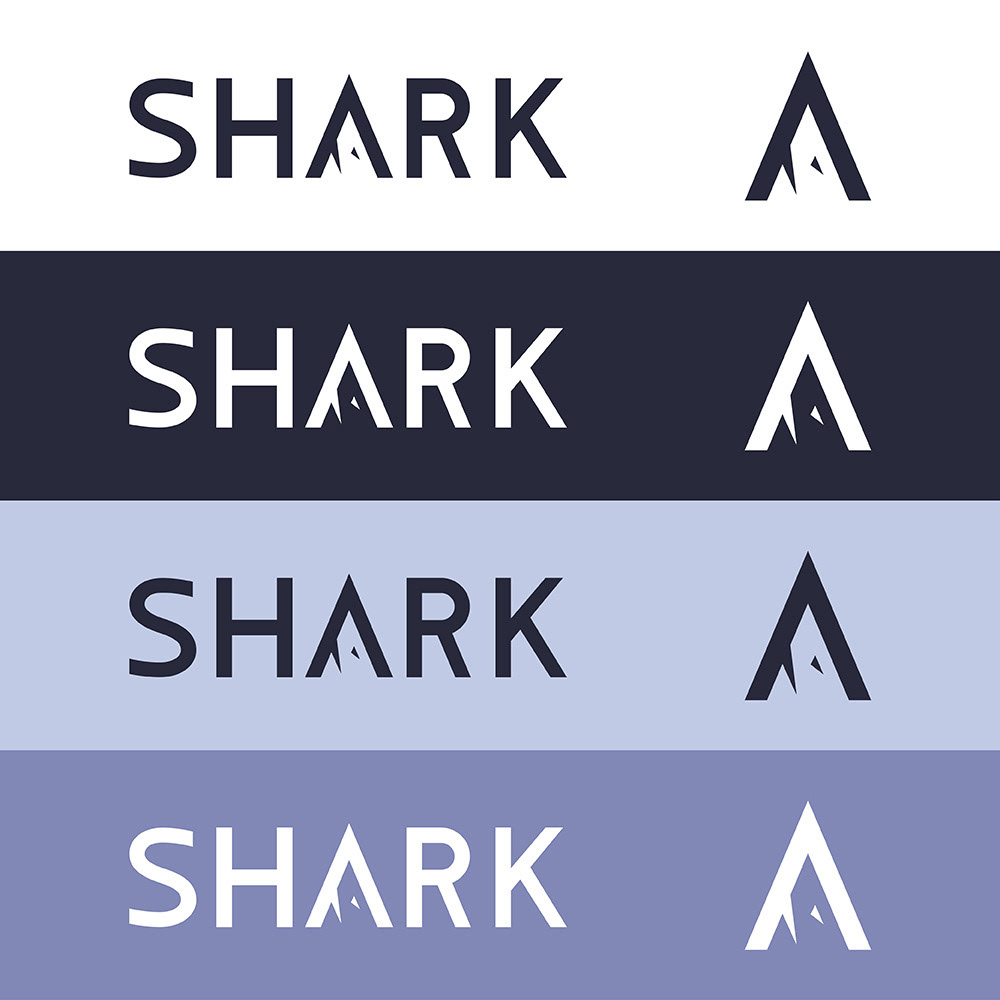
The main colors of the logo are dark blue and white. Additionally, 2 gray-blue shades are taken.
Logo animation was also developed.
